Dashboards
A dashboard presents several results together on a single screen, combining key figures and charts into one clear, visual overview. Quarto builds one from the same plain-text, reproducible workflow you use for everything else, with format: dashboard.
When a Dashboard Helps
Dashboards are useful whenever you want to show data and results directly, for example in a meeting or on a project website, rather than write a full report. The people looking will often just want a quick, current view of a few key indicators. A dashboard gives them that, drawn from the same reproducible analysis as the rest of your work rather than built in a separate tool.
How A Dashboard Is Structured
A Quarto dashboard is built from a few simple pieces:
format: dashboardin the YAML turns the document into a dashboard.- Headings lay out the page:
##starts a row, and the cards inside it sit side by side as columns. - Cards are the panels that hold your content. Two special kinds are value boxes (a single headline number) and plot cards (a chart).
In code, the shape looks like this (each code cell uses an executable {r} block, shown here as plain text):
---
title: "My Dashboard"
format: dashboard
---

## Row

```r
#| content: valuebox
#| title: "Sites monitored"
list(value = 4)
```

## Row

```r
#| title: "A chart"
plot_ly(...)
```
What You Will Build
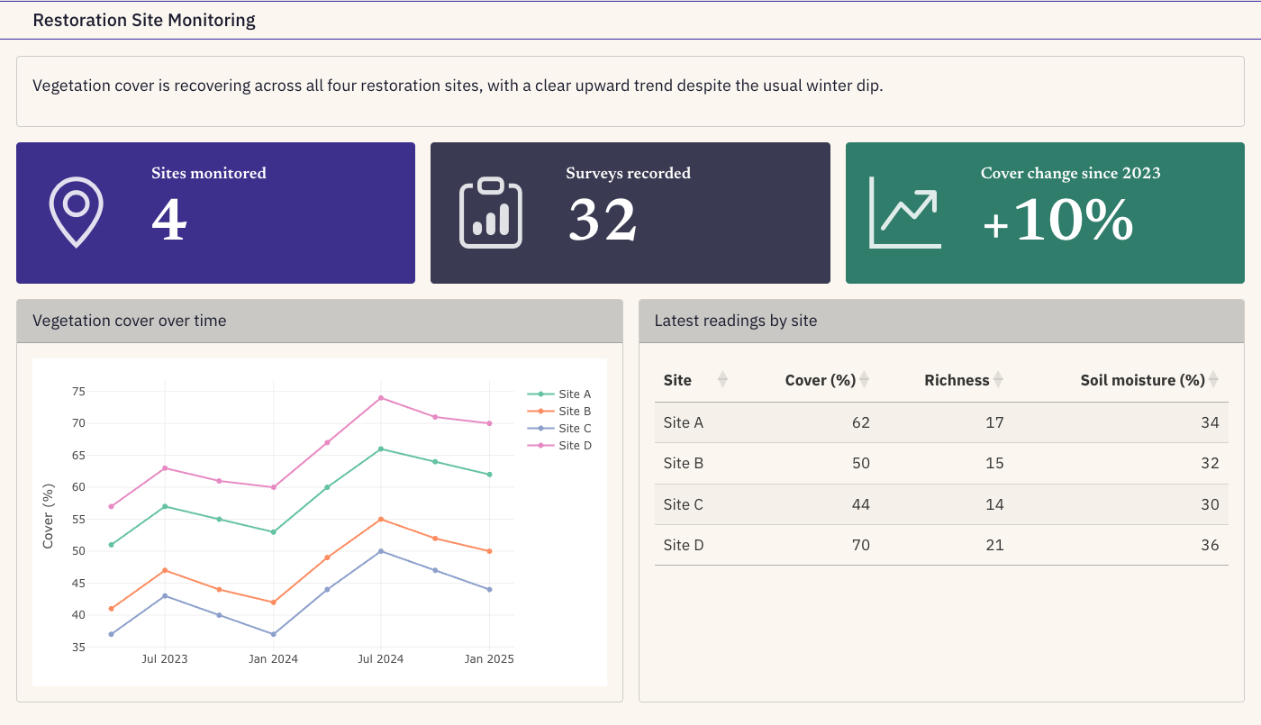
In the exercise you will build a small restoration-monitoring dashboard with three value boxes, an interactive chart, and a sortable table. It looks like this:
You can also explore the live version right here. Hover over the charts to read values, and click items in the legend to toggle sites:
A dashboard is normally a full-screen page of its own. See it in full screen here.
How Interactive Can a Dashboard Be?
Quarto dashboards can be interactive in several ways, all running entirely in the browser with no server. You can try the first two on the live dashboard above:
- Plotly charts: hover to read exact values, zoom and pan, and click items in the legend to show or hide individual series.
- Sortable tables: click a column header in the table above to reorder the rows (built with the
DTpackage). - Tabsets: switch between several precomputed views, for example the same metric under different management scenarios. Because every view is built when the document is rendered, this feels like a what-if explorer while the page stays completely static. The exercise shows how to add this.
The boundary is genuine reactivity. A dashboard that recomputes its data in response to user input, such as filters or sliders that re-run the analysis, needs a running server which a static host like GitHub Pages cannot provide. To build such a dashboard you can use the Shiny framework.