Multi-Lingual Quarto with Babelquarto
Thanks to the nifty R package (babelquarto)[https://docs.ropensci.org/babelquarto/] you can also produce quarto-based content content in multiple languages with a link to switch between them. THe package currently allows you to do this for project types with html output format e.g. books and websites, and one of the authors has recently contributed some code to expand this to presentations (revealjs) as well.
The packages website provides full vignettes of how to use it but in simple terms you enter the details of the languages options within your _quarto.yml file.
babelquarto:
  languagelinks: navbar
  languagecodes:
  - name: de
    text: "DE"
  - name: en
    text: "EN"
  mainlanguage: 'en'
  languages: ['de']
title-de: Arbeitsgruppe „Daten- und Modellierungsinfrastruktur für Living Labs“
description-de: „Dies ist die Website der Arbeitsgruppe „Daten- und Modellierungsinfrastruktur für Living Labs“ (SWG) des Innovationszentrums für Agrarsystemtransformation (IAT) als Teil des Leibniz-Zentrums für Agrarlandschaftsforschung (ZALF).“
author-de: author in de
lang: enbabelquarto contains several functions, e.g. quarto_multilingual_book to initialise projects and complete the required yaml entries for you automatically.
Then you create copes of any of the .qmd files in the project that you would like to have in different languages with corresponding langauge short codes suffixes in the file names, for example; index.qmd (the English version) and index.de.qmd the German version.
The project is then rendered with the appropriate babelquarto function (render_website() or render_book()) and the rendered files from the alternative languages are placed within an appropriately sub-directory of the project output dir.
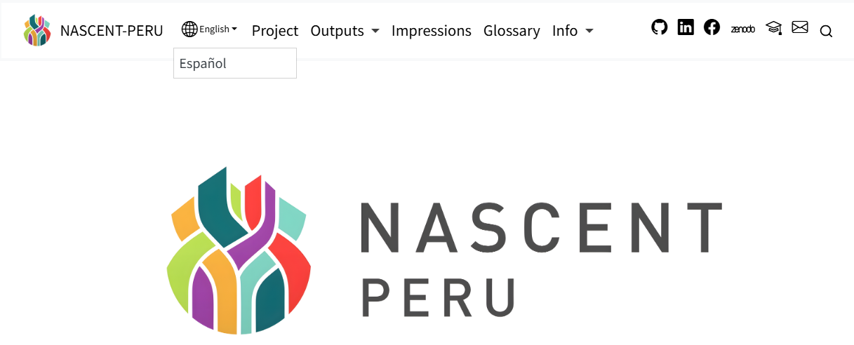
You will see that pages then have a button in the navbar for changing languages:
The appearance of the language button can be modified with Sass/CSS here is an example from one of our own websites:
  /* The wrapping <li> is the flex item inside .navbar-nav. Push it to
     the right and give it nav-link horizontal padding so the gap to
     the next nav-item matches the rest of the navbar. */
  .navbar-nav > li:has(#languages-links-parent) {
    order: 999;
    margin-inline-start: auto;
    padding-inline: var(--bs-nav-link-padding-x, 1rem);
  }

  #languages-links-parent {
    display: inline-flex;
    align-items: baseline;
    gap: 0.25rem;

    /* Current-language toggle button — active style */
    .babelquarto-languages-button {
      background-color: transparent !important;
      border: none !important;
      box-shadow: none !important;
      border-radius: 0 !important;
      padding: var(--bs-nav-link-padding-y, 0.5rem) 0 !important;

      color: $brand-teal-dark !important;
      font-size: inherit;
      font-weight: 600;
      text-decoration: underline;
      text-underline-offset: 4px;
      text-decoration-thickness: 1.5px;

      /* Bootstrap's dropdown caret + the globe icon */
      &::after { display: none !important; }
      .bi-globe2,
      .bi-globe,
      i.bi { display: none !important; }

      &:hover,
      &:focus,
      &:active,
      &.show {
        background-color: transparent !important;
        color: $brand-teal-dark !important;
        box-shadow: none !important;
      }
    }

    /* Promote the dropdown menu to render inline (not as a floating popup) */
    > .dropdown-menu,
    #languages-links {
      display: inline-flex !important;
      position: static !important;
      float: none !important;
      inset: auto !important;
      transform: none !important;
      background: transparent !important;
      border: none !important;
      box-shadow: none !important;
      border-radius: 0 !important;
      padding: 0 !important;
      margin: 0 !important;
      list-style: none !important;
      min-width: 0 !important;
      align-items: baseline;
      gap: 0.4rem;

      /* Each <li> precedes its item with a slash separator */
      > li {
        display: inline-flex;
        align-items: baseline;
        gap: 0.4rem;

        &::before {
          content: "/";
          color: #9CA29F;
          font-weight: 500;
        }
      }

      .dropdown-item {
        display: inline;
        width: auto !important;
        padding: var(--bs-nav-link-padding-y, 0.5rem) 0 !important;
        background: transparent !important;
        color: #9CA29F !important;
        font-size: inherit;
        font-weight: 500;
        text-decoration: none !important;
        transition: color 0.15s ease;

        &:hover,
        &:focus {
          color: $brand-teal-dark !important;
          text-decoration: underline !important;
          text-underline-offset: 4px;
          background: transparent !important;
        }
      }
    }
  }
}

/* Force the language switcher into a consistent visual order regardless
   of which language page we're on. The real flex children of
   #languages-links-parent are the button (current lang) and the
   ul.dropdown-menu (other lang) — NOT the <li> inside the menu, which
   sits inside a separate inline-flex context.

   On EN pages the natural source order is "[button EN][ul / DE]" →
   "EN / DE", which is already correct, so no override needed.

   On DE pages the natural order would render "DE / EN" (and flip
   positions on each language click). We swap by pulling the menu to
   the left, suppressing the menu's leading slash, and adding a fresh
   leading slash to the button (now the rightmost item). */
html[lang="de"] #languages-links-parent {
  > .dropdown-menu,
  > #languages-links {
    order: -1;                                      /* EN other → left  */
    > li::before { content: none !important; }      /* drop leading "/" */
  }

  .babelquarto-languages-button {
    /* default order keeps button to the right of the menu (DE → right) */
    &::before {
      content: "/";
      /* inline-block + explicit text-decoration: none breaks the
         button's underline from extending across the slash */
      display: inline-block;
      text-decoration: none;
      color: #9CA29F;
      font-weight: 500;
      margin-inline-end: 0.4rem;
    }
  }
}

.navbar-logo {
  max-height: 44px;
}

/* On desktop, pin the language switcher to the far-right edge of the
   navbar by absolute-positioning its wrapping <li>. This leaves the
   regular nav links, the search button, and the theme toggle in their
   normal flex positions and only the switcher sits to their right.

   `.navbar.fixed-top` already has `position: fixed`, so it is the
   nearest positioned ancestor; `right: 1rem` anchors to its right edge.

   On mobile (< 992px) the wrapping <li> stays in-flow inside the
   collapsed nav menu — absolute positioning is scoped to lg+ only. */
@media (min-width: 992px) {
  .navbar .navbar-nav > li:has(#languages-links-parent) {
    position: absolute;
    right: 1rem;
    top: 50%;
    transform: translateY(-50%);

    /* Undo the in-flow nudges from the base rule above; absolute items
       don't participate in the flex layout and these would otherwise
       leave behind ghost spacing inside the nav-nav. */
    order: 0;
    margin-inline-start: 0;
    padding-inline: 0;
  }

  /* Reserve right-side padding on the navbar container so the absolutely-
     positioned switcher cannot overlap the search button at narrow lg. */
  .navbar > .container-fluid,
  .navbar > .container {
    padding-inline-end: 6rem;
  }
}